Building a Node-RED module for the Button+
June 18, 2026
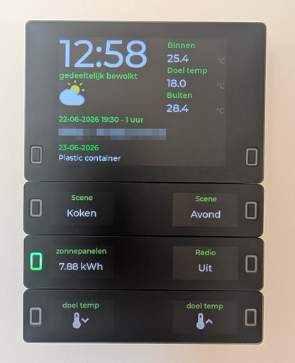
I bought a Button+ a few months ago as a pre-order. The goal was to display the household agenda, control the lighting and show values from data points in and around the house. It is the perfect device for that. I bought it with three bars and a display, so I have plenty of options to show the data. I connected it to my MQTT server, which I had to reconfigure a bit to support WebSockets, and configured the buttons and display items.
How I publish information to display on the device
The device works with information published via MQTT. Since I was already running an MQTT server, this wasn't a big deal for me. The device can display existing MQTT topics and you can publish data to the topics of the device itself to show data on it. Since I used my MQTT server only for connecting services together, for example Zigbee2MQTT and my Itho Daalderop heat recovery system, I wasn't sure how to publish the Home Assistant data to MQTT so it could be used by the Button+. I ended up using the MQTT statestream integration, which is only available in YAML.
I decided to do all this configuration in a separate file like I do with all the custom YAML I use in Home Assistant. I added mqtt_statestream: !include mqtt_statestream.yaml to my configuration.yaml and created the separate configuration file (mqtt_statestream.yaml):
base_topic: homeassistant/statestream
publish_attributes: true
publish_timestamps: true
include:
  domains:
    - climate
  entities:
    - sensor.energie_zelfvoorzienend
    - sensor.energie_zelfverbruik_zon
    - sensor.energieproductie_vandaag
    - sensor.energieverbruik_vandaag
    - sensor.energie...
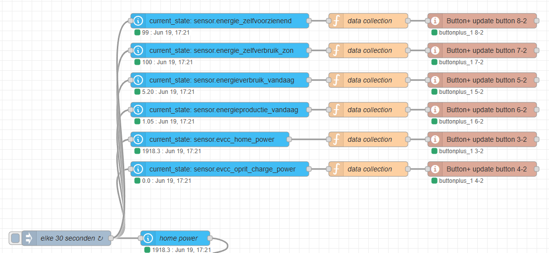
With this configured, Home Assistant streams the state of the configured entities and domains to an MQTT topic. For example, the state of sensor.energie_zelfvoorzienend is published to the MQTT topic homeassistant/statestream/sensor/energie_zelfvoorzienend/state. This topic can be configured in the Button+ to display the value. The downside of this approach is that you cannot combine topics in the Button+, for example the state and unit of measure. At least not on the buttons; display items do have a unit option that can be set to an MQTT topic.
Node-RED
This is where Node-RED comes into play. I already use Node-RED for almost all of my automations, as it is much stronger than the built-in automation builder for Home Assistant. At least the last time I tried it, a couple of years ago... I know, it has improved a lot!
The Button+ is constantly listening to what you write to its topics. By default, every button you configure has its own topics for the label, value, LED, LED color, etc. By combining various sensor values you can, for example, display both the state and unit of measure on a button.
Because I was repeating code a lot, I decided to make subflows with exposed variables to easily control the device. That already made the flows cleaner, but it still felt like plumbing I had to copy around. Every button update needed the same topic structure, every LED action needed the same MQTT messages, and every SVG or label update had to be wired by hand.
Turning the subflows into a Node-RED module
That is why I created buttonplus-nodered, a small Node-RED module for controlling Button+ devices over MQTT. Instead of building MQTT topics manually in function nodes, the module adds a set of Button+ nodes to the Node-RED palette with the common actions:
- Button+ config: one shared configuration for the MQTT broker, topic prefix, device id, QoS and retain settings.
- Button+ click: listens to short and long button presses and exposes them on separate outputs.
- Button+ LED: controls the front LED, wall LED or both, including color, brightness and pulse behaviour.
- Button+ update button: updates the top label, value label, SVG and optional LED state for a button.
- Button+ update display: updates display items with a label, value, unit and SVG.
- Button+ update global: changes global settings such as the active page and display brightness.
The most useful part for me is that node configuration and incoming msg properties work together. I can configure a default page and button in the node, but still override values from a flow when needed. That makes it easy to reuse one flow pattern for multiple buttons or display items without duplicating all the MQTT logic.
For click events I also added output properties, inspired by the Home Assistant nodes for Node-RED. You can decide what is sent on msg.payload, add metadata like the device, page and button, or include debug information with the MQTT messages that were received or sent. This makes the node useful both for simple automations and for debugging more complex flows.
Rendering larger SVGs
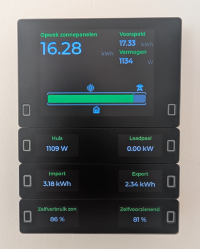
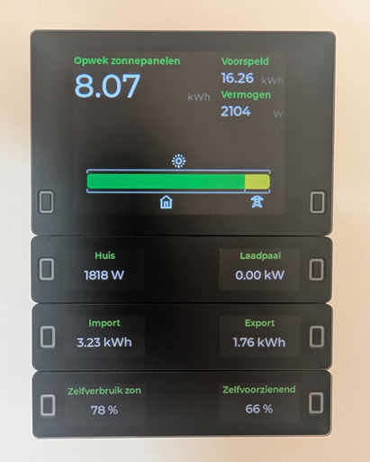
In my homelab I use EVCC as energy manager. It controls and visualizes the energy flow between solar, the house, the grid, my car charger and in the future the battery. One thing I really like about EVCC is the energy flow view: it gives you a quick overview of where the power is coming from and where it is going. I wanted to recreate that same idea on the Button+ display, so I could see the current energy flow without opening the EVCC dashboard.
My first approach was to generate one large SVG in Node-RED and publish it to a single Button+ display item. That worked for smaller tests, but the SVG quickly became too large once I added the bar, labels, icons and flow lines. The current Button+ firmware renders SVGs at a fixed size per item, so the full EVCC-style render did not fit in one item.
I solved this by rendering the energy flow as one virtual SVG canvas in Node-RED and slicing it into multiple smaller SVGs for the Button+. The function node builds a 288x96 view made out of twelve 48x48 panels: six columns and two rows. Each returned message gets its own item, row, col and svg property. The SVG itself uses a different viewBox per panel, so every Button+ display item only receives a small piece of the larger drawing.
This keeps the visual result as one continuous EVCC-like energy flow, while the Button+ only has to render twelve small SVG payloads instead of one large one. The Button+ update display node then publishes each msg.svg to the correct display item. The actual automation can stay focused on the data: read the Home Assistant sensor values, normalize W and kW, calculate import/export and battery charge/discharge, generate the SVG pieces and send them to the Button+ nodes.
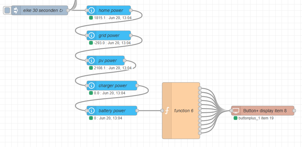
This is the function node that creates the energy flow. It expects the Home Assistant values on msg.pv, msg.home, msg.charger, msg.grid and optionally msg.battery, then returns twelve messages for the twelve Button+ display items.
function n(v) {
    return Number(v) || 0;
}

function watt(o) {
    const v = n(o?.state);
    const u = String(o?.attributes?.unit_of_measurement || "W");
    return u === "kW" ? v * 1000 : v;
}

// --- Inputs ---
const pv = watt(msg.pv);
const home = watt(msg.home);
const charger = watt(msg.charger);
const grid = watt(msg.grid); // + = import, - = export
const battery = msg.battery ? watt(msg.battery) : 0; // + = ontladen, - = laden

const gridImport = Math.max(grid, 0);
const gridExport = Math.max(-grid, 0);
const battDischarge = Math.max(battery, 0);
const battCharge = Math.max(-battery, 0);

// --- IN-schaal ---
const inSelfPv = Math.max(pv - gridExport, 0);
const inPvExport = gridExport;

// --- OUT-schaal (bestemmingen) ---
const outHome = home;
const outCar = charger;
const outGridExport = gridExport;
const outBattCharge = battCharge;

// --- Geometrie (6 kolommen x 2 rijen x 48px = 288x96) ---
// Function node Outputs = 12. Rij 1 = boven, rij 2 = onder (zelfde kolom-X).
// Display items: zie DISPLAY_LAYOUT onderaan dit bestand.
const PANELS = 6;
const ROWS = 2;
const SEG = 48;
const ROW_H = 48;
const VB_W = PANELS * SEG;
const VB_H = ROW_H * ROWS;
const barX = 4;
const barW = VB_W - 8;
const r = 4;
const BAR_SEAM = ROW_H; // y=48: naad door midden balk
const iconSize = 24;
const ICON_LINE_GAP = 2;
const LINE_BAR_GAP = 6;
const TICK_LEN = 5;
const TICK_GAP = 2; // horizontale onderbreking bij tick (geen overlap)
const barH = 22;
const barY = BAR_SEAM - barH / 2;
const topY = barY - LINE_BAR_GAP;
const bottomY = barY + barH + LINE_BAR_GAP;
const inIconY = topY - ICON_LINE_GAP - iconSize;
const topTickY = topY + TICK_LEN;
const botTickY = bottomY - TICK_LEN;
const outIconY = bottomY + ICON_LINE_GAP;
const ICON_MARGIN = 3;
const LABEL_Y = BAR_SEAM + 3;
const LABEL_FS = 11;
const STROKE_MAIN = 1.75;

const MIN_ICON_W = 12;
const MIN_SEG_W = 2;

function clamp(v, min, max) {
    return Math.max(min, Math.min(max, v));
}

function hLineWithGaps(y, tickXs) {
    const half = TICK_GAP / 2;
    const sorted = [...new Set(tickXs)].sort((a, b) => a - b);
    const parts = [];
    let pos = barX;
    for (const tx of sorted) {
        const g0 = tx - half;
        const g1 = tx + half;
        if (g0 > pos) parts.push(`M${pos} ${y}H${g0}`);
        pos = Math.max(pos, g1);
    }
    if (pos < barX + barW) parts.push(`M${pos} ${y}H${barX + barW}`);
    return parts;
}

function fmt(v) {
    return v >= 1000
        ? `${(v / 1000).toFixed(1).replace(".", ",")} kW`
        : `${Math.round(v)} W`;
}

function widths(values) {
    const totalVal = Math.max(values.reduce((a, b) => a + b, 0), 1);

    let w = values.map((v) => (v > 0 ? Math.round((v / totalVal) * barW) : 0));
    w = w.map((px) => (px > 0 && px < MIN_SEG_W ? 0 : px));

    const diff = barW - w.reduce((a, b) => a + b, 0);
    if (diff !== 0) {
        for (let i = w.length - 1; i >= 0; i--) {
            if (w[i] > 0) {
                w[i] = Math.max(w[i] + diff, 0);
                break;
            }
        }
    }

    let acc = 0;
    return w.map((px) => {
        const x = barX + acc;
        acc += px;
        return { x, w: px };
    });
}

function rect(x, w, c, left, right) {
    if (w <= 0) return "";
    if (!left && !right) {
        return `<rect x="${x}" y="${barY}" width="${w}" height="${barH}" fill="${c}"/>`;
    }
    if (left && right) {
        return `<rect x="${x}" y="${barY}" width="${w}" height="${barH}" rx="${r}" fill="${c}"/>`;
    }
    if (left) {
        return `<path d="M${x + r} ${barY}H${x + w}V${barY + barH}H${x + r}A${r} ${r} 0 0 1 ${x} ${barY + barH - r}V${barY + r}A${r} ${r} 0 0 1 ${x + r} ${barY}Z" fill="${c}"/>`;
    }
    return `<path d="M${x} ${barY}H${x + w - r}A${r} ${r} 0 0 1 ${x + w} ${barY + r}V${barY + barH - r}A${r} ${r} 0 0 1 ${x + w - r} ${barY + barH}H${x}Z" fill="${c}"/>`;
}

function label(seg, txt) {
    if (seg.w <= 10) return "";
    return `<text x="${seg.x + seg.w / 2}" y="${LABEL_Y}" text-anchor="middle" font-size="${LABEL_FS}" fill="#111">${txt}</text>`;
}

// EVCC iconen (48x48), inline gerenderd (Button+ ondersteunt <use> niet betrouwbaar)
const ICONS = {
    sun: '<path d="M24 34c5.514 0 10-4.486 10-10s-4.486-10-10-10-10 4.486-10 10 4.486 10 10 10m6-10c0 3.309-2.691 6-6 6s-6-2.691-6-6 2.691-6 6-6 6 2.691 6 6M22 4h4v6h-4zM22 38h4v6h-4zM4 22h6v4H4zM38 22h6v4h-6zM12.268 7.68l3.464-2 3 5.196-3.464 2zM29.267 37.122l3.465-2 3 5.196-3.465 2zM5.68 32.267l5.195-3 2 3.465-5.195 3zM35.125 15.269l5.196-3 2 3.466-5.196 3zM5.68 15.732l2-3.465 5.196 3-2 3.465zM35.124 32.734l2-3.465 5.196 3-2 3.465zM12.267 40.32l3-5.197 3.464 2-3 5.196zM29.269 10.875l3-5.195 3.465 2-3 5.196z"/>',
    home: '<path d="M8 44h32V20h4L24 4 4 20h4zm18-4h-4V28h4zM12 18.723l12-9.6 12 9.6V40h-6V24H18v16h-6z"/>',
    car: '<circle cx="16" cy="26" r="2"/><circle cx="32" cy="26" r="2"/><path d="M42 18h-3.8c-.5-4.5-4.3-8.1-9-8.1H18.8c-4.7 0-8.5 3.6-9 8.1H6c-1.1 0-2 .9-2 2s.9 2 2 2h2.4c-.3.6-.4 1.3-.4 2v10.4c.2 2 1.9 3.6 4 3.6s3.8-1.6 4-3.6V34h16v.4c.2 2 1.9 3.6 4 3.6s3.8-1.6 4-3.6V24c0-.7-.1-1.4-.3-2H42c1.1 0 2-.9 2-2s-.9-2-2-2m-23.2-4.1h10.5c2.4 0 4.5 1.7 4.9 4.1H13.8c.5-2.4 2.5-4.1 5-4.1M14 30c-1.1 0-2-.9-2-2v-4c0-1.1.9-2 2-2h20c1.1 0 2 .9 2 2v4c0 1.1-.9 2-2 2z"/>',
    grid: '<path d="m43.109 14.336-12-8a2 2 0 0 0-.151-.08 2 2 0 0 0-.19-.1 2 2 0 0 0-.255-.079c-.04-.011-.077-.027-.118-.035A2 2 0 0 0 29.981 6h-12a2 2 0 0 0-.378.039c-.05.01-.1.029-.145.042a1.4 1.4 0 0 0-.49.211c-.027.016-.055.025-.081.043h-.008L4.891 14.336A2 2 0 0 0 6 18h10v5.528L8.211 39.106a2 2 0 0 0 2.649 2.7L24 35.549l13.14 6.258a2 2 0 0 0 2.649-2.7L32 23.528V18h10a2 2 0 0 0 1.109-3.664M20 10h8v4h-8Zm-7.394 4L16 11.738V14Zm16.158 12 1.151 2.3L24 31.119 18.085 28.3l1.151-2.3Zm-14.375 9.7 1.911-3.819 3.052 1.453Zm14.263-2.362 3.048-1.457 1.911 3.819ZM28 22h-8v-4h8Zm4-8v-2.263L35.4 14Z"/>',
    bat: '<path d="M35 9.996h-3v-4a2 2 0 00-2-2H18a2 2 0 00-2 2v4h-3a2 2 0 00-2 2v30a2 2 0 002 2h22a2 2 0 002-2v-30a2 2 0 00-2-2zm-15-2h8v2h-8v-2zm13 32H15v-26h18v26z"/>',
};

function inlineIcon(key, x, y) {
    const sc = (iconSize / 48).toFixed(2);
    return `<g transform="translate(${x} ${y}) scale(${sc})" fill="#fff">${ICONS[key]}</g>`;
}

// Balk: groen/geel PV-split + andere bronnen
const barDefs = [
    { val: inSelfPv, color: "#10df45" },
    { val: battDischarge, color: "#3b82f6" },
    { val: gridImport, color: "#9b9ca5" },
    { val: inPvExport, color: "#f5e600" },
];

// In-lijn/iconen: alleen echte bronnen (PV als een bron, geen ticker op export-split)
const inSourceDefs = [
    { val: pv, icon: "sun", showIcon: pv > 0, group: "pv" },
    { val: battDischarge, icon: "bat", showIcon: battDischarge > 0, group: "bat" },
    { val: gridImport, icon: "grid", showIcon: gridImport > 0, group: "grid" },
];

const outDefs = [
    { val: outHome, icon: "home", showIcon: true, group: "home" },
    { val: outCar, icon: "car", showIcon: true, group: "car" },
    { val: outGridExport, icon: "grid", showIcon: gridExport > 0, group: "grid" },
    { val: outBattCharge, icon: "bat", showIcon: true, group: "bat" },
];

const barSegs = widths(barDefs.map((d) => d.val));
const inSourceSegs = widths(inSourceDefs.map((d) => d.val));
const outSegs = widths(outDefs.map((d) => d.val));

function buildRow(defs, segs, y, iconY, tickY) {
    const groups = [];

    segs.forEach((seg, i) => {
        if (seg.w <= 0) return;
        const g = defs[i].group;
        const last = groups[groups.length - 1];
        const hasIcon = defs[i].showIcon !== false && defs[i].icon;

        if (last && last.group === g) {
            last.end = seg.x + seg.w;
            if (hasIcon && (!last.showIcon || seg.w > last.iconW)) {
                last.iconW = seg.w;
                last.icon = defs[i].icon;
                last.showIcon = true;
                last.iconStart = seg.x;
                last.iconEnd = seg.x + seg.w;
            }
        } else {
            groups.push({
                group: g,
                start: seg.x,
                end: seg.x + seg.w,
                icon: hasIcon ? defs[i].icon : null,
                showIcon: !!hasIcon,
                iconW: seg.w,
                iconStart: hasIcon ? seg.x : null,
                iconEnd: hasIcon ? seg.x + seg.w : null,
            });
        }
    });

    const icons = [];
    groups.forEach((grp) => {
        const w = grp.end - grp.start;
        if (!grp.showIcon || !grp.icon || w < MIN_ICON_W) return;
        const iStart = grp.iconStart ?? grp.start;
        const iEnd = grp.iconEnd ?? grp.end;
        const cx = Math.round(
            clamp(iStart + (iEnd - iStart) / 2, barX + ICON_MARGIN, barX + barW - ICON_MARGIN),
        );
        icons.push(inlineIcon(grp.icon, cx - iconSize / 2, iconY));
    });

    const tickXs = [barX, barX + barW];
    let prevActive = -1;
    for (let i = 0; i < segs.length; i++) {
        if (segs[i].w <= 0) continue;
        if (prevActive >= 0) {
            const x = segs[prevActive].x + segs[prevActive].w;
            if (x > barX && x < barX + barW) tickXs.push(x);
        }
        prevActive = i;
    }

    const p85 = hLineWithGaps(y, tickXs);
    for (const x of tickXs) p85.push(`M${x} ${y}V${tickY}`);

    return { p85, icons };
}

const inRow = buildRow(inSourceDefs, inSourceSegs, topY, inIconY, topTickY);
const outRow = buildRow(outDefs, outSegs, bottomY, outIconY, botTickY);

const path85 = inRow.p85.join("") + outRow.p85.join("");
const icons = inRow.icons.join("") + outRow.icons.join("");

const firstBar = barSegs.findIndex((s) => s.w > 0);
let lastBar = -1;
for (let i = barSegs.length - 1; i >= 0; i--) {
    if (barSegs[i].w > 0) {
        lastBar = i;
        break;
    }
}

let bars = "";
barSegs.forEach((seg, i) => {
    if (seg.w <= 0) return;
    bars += rect(seg.x, seg.w, barDefs[i].color, i === firstBar, i === lastBar);
});

let labels = "";
barSegs.forEach((seg, i) => {
    if (barDefs[i].val > 0 && seg.w > 0) labels += label(seg, fmt(barDefs[i].val));
});

const inner =
    `<g stroke="#fff" fill="none" stroke-width="${STROKE_MAIN}" stroke-linecap="butt" stroke-linejoin="miter"><path d="${path85}"/></g>` +
    bars +
    icons +
    labels;

const ITEM_START = 8;

return Array.from({ length: PANELS * ROWS }, (_, n) => {
    const row = Math.floor(n / PANELS);
    const col = n % PANELS;
    const panel = n + 1;
    const item = ITEM_START + n;
    const svg =
        `<svg width="${SEG}" height="${ROW_H}" viewBox="${col * SEG} ${row * ROW_H} ${SEG} ${ROW_H}">${inner}</svg>`;
    return [{ ...msg, payload: panel, item, row: row + 1, col: col + 1, panel, svg, svgChars: svg.length }];
});

// DISPLAY_LAYOUT (msg.item -> x%, y%, width%):
// Item 8-13 rij 1, item 14-19 rij 2. Kolom-X: 5 | 20 | 35 | 50 | 65 | 80 - width: 15%
// Rij 1 (item 8-13):  y = 40%   |   Rij 2 (item 14-19): y = 55%
Installing it
The module is published as @nielseulink/node-red-contrib-buttonplus. You can install it from the Node-RED palette manager by searching for buttonplus, or install it manually:
npm install @nielseulink/node-red-contrib-buttonplus
After restarting Node-RED, the Button+ nodes are available in the palette. The repository also includes an example flow that shows the shared config node, a button click node, LED feedback and debug output.
What's next?
For now the module covers the parts I use most: button presses, labels, display items, LED feedback, page switching and brightness. I will keep extending the project while I configure my Button+ device. Feel free to participate in the project, or contact me if you have questions.
Update 20-06-2026: After sharing this approach in issue 334 on the Button+ support issues page, the maker of Button+ mentioned that an upcoming firmware update should make larger SVG rendering possible by reading the width and height attributes from the SVG tag. That would remove the need to split the image into separate display items. Once that update is available I will adjust my Node-RED code for it and write a follow-up post about the simpler approach.